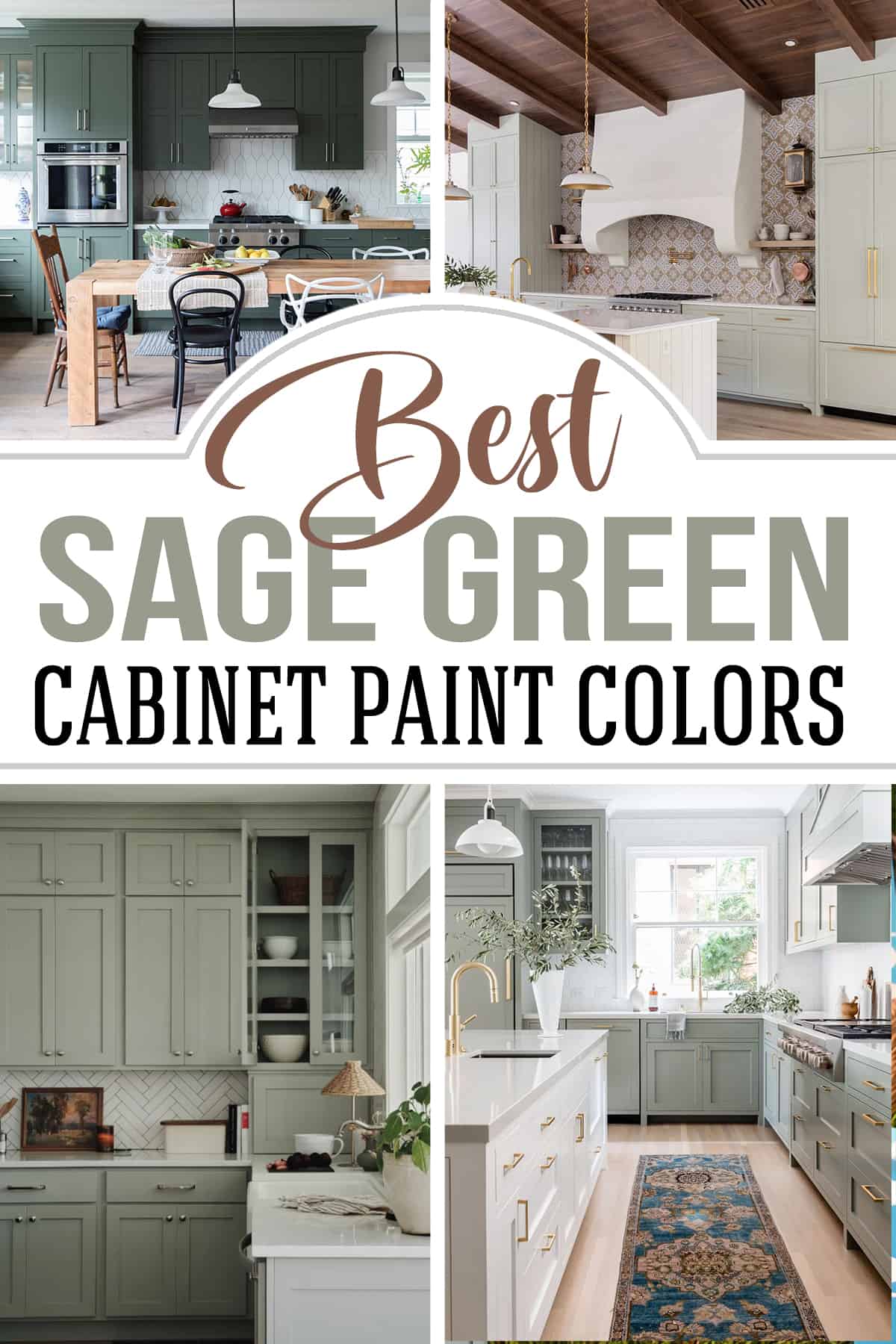
Sage green is a popular choice for kitchens, and we’re here to celebrate it. Calming and serene, sage green cabinets are a stunning way to sooth and add an organic feel to the workhorse of the home. Check out these calming paint colors in real life homes!
Painting with sage green feels like you’ve invited a piece of the outdoors in, giving your space a timeless and serene quality. A hue aptly named after the leaves of the sage plant, known for their grayish-green hue, this earthy green is considered nature’s neutral.
What better room to inject a sense of calm than the kitchen? I can think of no better space where maintaining a balance between function and harmony is more important.
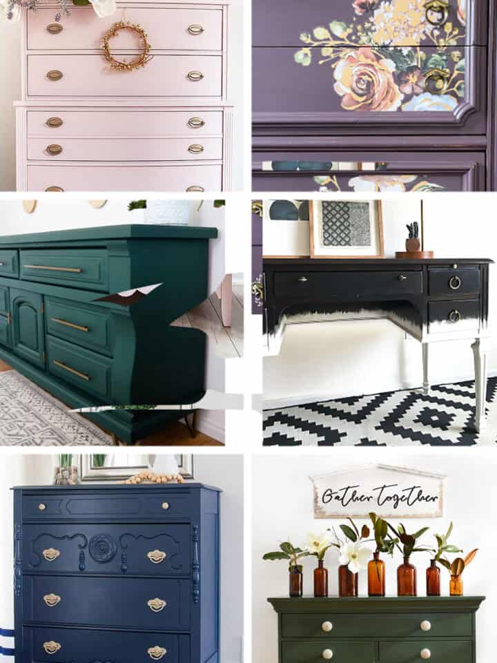
If you are looking to undertake this project, learn more about how to paint kitchen cabinets like a pro or my top picks for furniture paint.
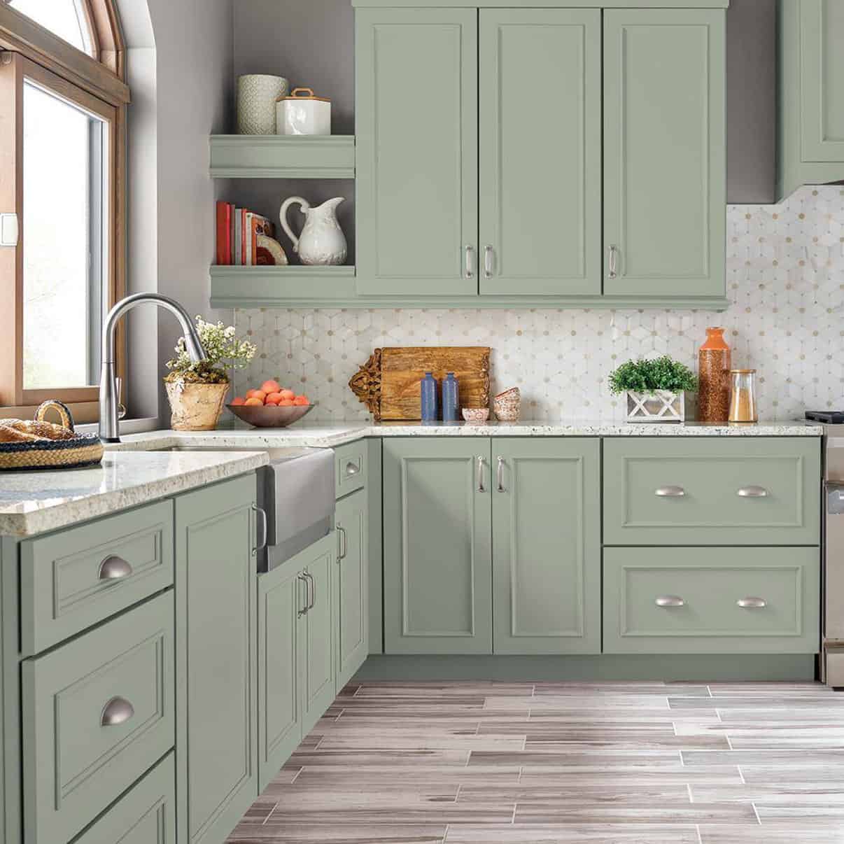
Medium to light in tone, sage green is a versatile color that pairs well with other natural colors and different textures. The muted undertones shines for both farmhouse and rustic aesthetics, and they look just as grand in traditional kitchens and Victorian styled homes.
The Best Sage Green Paint for Kitchen Cabinets
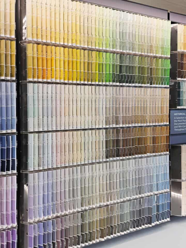
You might find a stunning photo online, but often it’s no easy feat to pinpoint the color that was used. No need to worry! I’ve spent hours tracking down photos of real kitchens and the corresponding sage green paint colors. Ready to explore all the shades of sage? I’ve collected my favorites just for you!
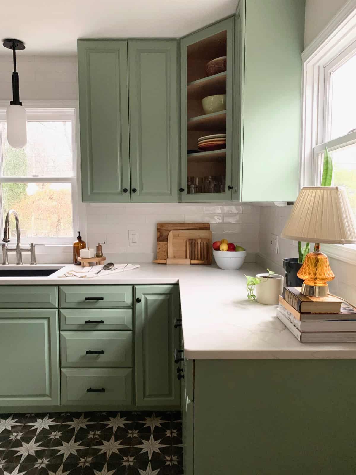
Like most shades, sage green can vary in depth, saturation, or lightness, and may have more grey, brown, or blue undertones in the mixture.
FAQs
Very much so. Sage greens topped the “Color of the Year” lists in 2022 and 2023. I don’t see it going anywhere anytime soon.
It’s an on trend color choice for kitchens, living rooms, and bathrooms. It works anywhere from the front door to a family space.
It pairs well with other organic hues such as taupe, mustard yellow, cream, grey, forest green, and brown. Craving something a bit bolder? Try shades of oranges and reds such as brick or oak hardwood floors, terra cotta pots, etc., as accents.
1. Narrow your color choices down to 2-5 colors. Don’t choose a color at the store.
2. Get paint samples. Never choose a color from a 2×2 swatch.
3. Paint a 2×3 piece of cardstock and hang it in the space.
4. Read my best tips for Choosing Interior Paint Colors
My personal favorite is antique brass or gold. Choose copper or black for something more striking. White gold, silver, and platinum are always an option, but they don’t allow much contrast to be as visually stimulating.
All colors can be “timeless” depending on how you use them. Color applications go in and out of style, think: avocado appliances, honey oak cabinets, dark green carpet, and petal pink bathrooms. Although those individual colors are still considered relevant, the application is considered outdated.
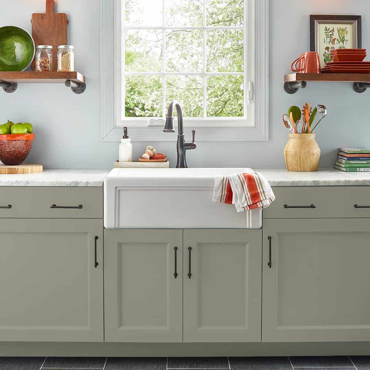
Marble countertops or white/light grey with some veining are generally the best match for green colors or sage green kitchen cabinets. Slate and black can also be a fitting option for a moodier aesthetic.
Behr Bitter Sage
Tackling this 1960’s kitchen complete restoration by Haneens Haven was a family affair. The mission? An inviting kitchen that felt warm and perhaps a bit whimsical, without sacrificing modern convenience. Behr Bitter Sage green cabinetry cultivates that balance, working as a hip neutral in this space.
Benjamin Moore Jojoba
Ready for a little more commitment? Dual rows of cabinetry rejuvenated with Benjamin Moore Jojoba and gleaming nickel hardware create a cozy yet refined look. The earthy orange and red accents really pop against an otherwise muted palette.
Behr Woodland Sage
Woodland sage is a warmer color, drenched with gold undertones. It’s cleverly positioned in this cheerful kitchen to bring forth the yin and the yang of its tonal essence. Warm walnut shelving and deep red accents invite the gold to shine, while quartz countertops and a greyish blue backsplash cool it off.
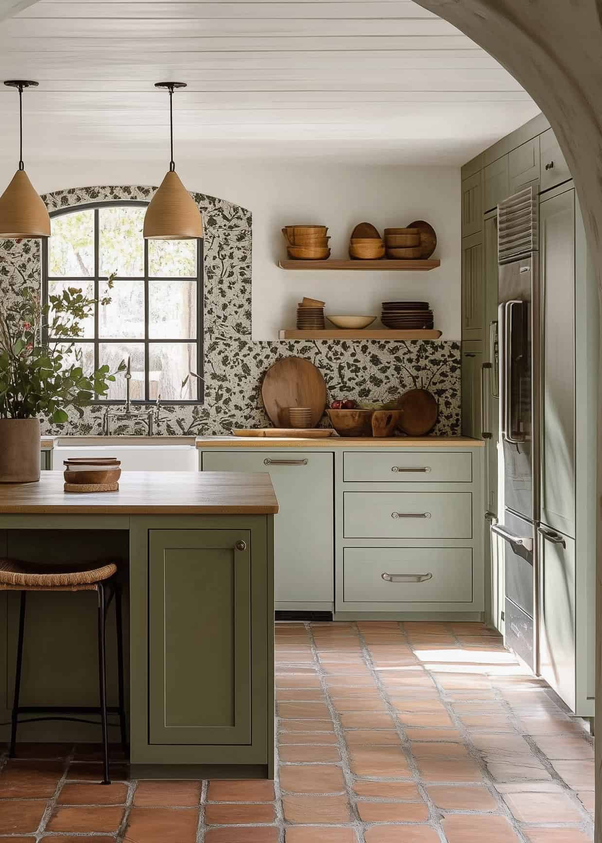
Benjamin Moore Forest Floor
The eclectic design featured in Studio Albertazzi’s Heritage Home remodel allows room for a multigenerational family and treasured heirlooms. The kitchen cupboards are painted in Benjamin Moore Forest Floor, echoing earthy garden tones. The tile and fixture selections pay homage to the family’s Italian heritage. Bellissima!
Benjamin Moore October Mist

When Jenna Sue Design had to choose a color for cabinets she built from scratch, it was a serious decision. October Mist by Benjamin Moore is an uplifting shade that closely resembles a flower stem. It works to beautifully anchor this newly bloomed space built by loving homeowners. The corresponding kitchen island works beautifully with the tones of the stunning Spanish tile backsplash.
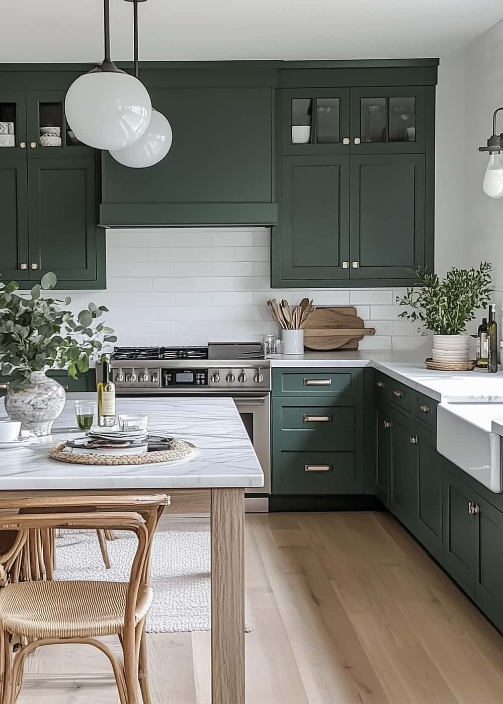
Sherwin Williams Sage
Although there are 50 shades of sage, Inspired by Charm is most partial to the classic by Sherwin Williams. Featured prominently in his kitchen design, this shade offers a chameleon-like ability. Light exposure and time of day affects the color essence due to the rich undertones of gray, brown, and yellow.
Benjamin Moore Oil Cloth
Oil Cloth is a subtle and sophisticated green with gray undertones to give it timeless appeal. In another example by Heidi Caillier Design, Oil Cloth was a great choice to add depth without being flashy. The kitchen cabinetry feels charming and inviting. There’s space for the beautiful patterns and rich textures to breathe in harmony.
Sherwin Williams Clary Sage
Bring a botanical vibe to your kitchen with Clary Sage, a mellow green with yellow undertones. Even with a plethora of cabinetry, it feels open and airy. Check out a lovely project by Caitlin Fleming here – a testament to the herbal-like quality of the hue. A white island breaks up the color block, harmonizing well with countertops and the back splash. Natural floors and gold fixtures provide textural balance.
Sherwin Williams Evergreen Fog
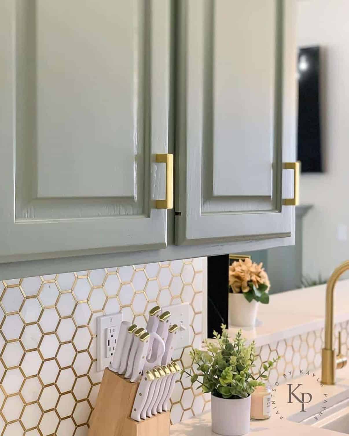
Builder grade honey oak cabinetry goes from drab to fab in this incredible Cinderella story from Painted by Kayla. Choosing Evergreen Fog, a greenish gray with a hint of blue, injected a sense of fresh zen to this bohemian inspired kitchen complete with a chic patterned back splash and new quartz countertops. The space feels current and youthful, inspiring nights in rather than noshing on takeout.
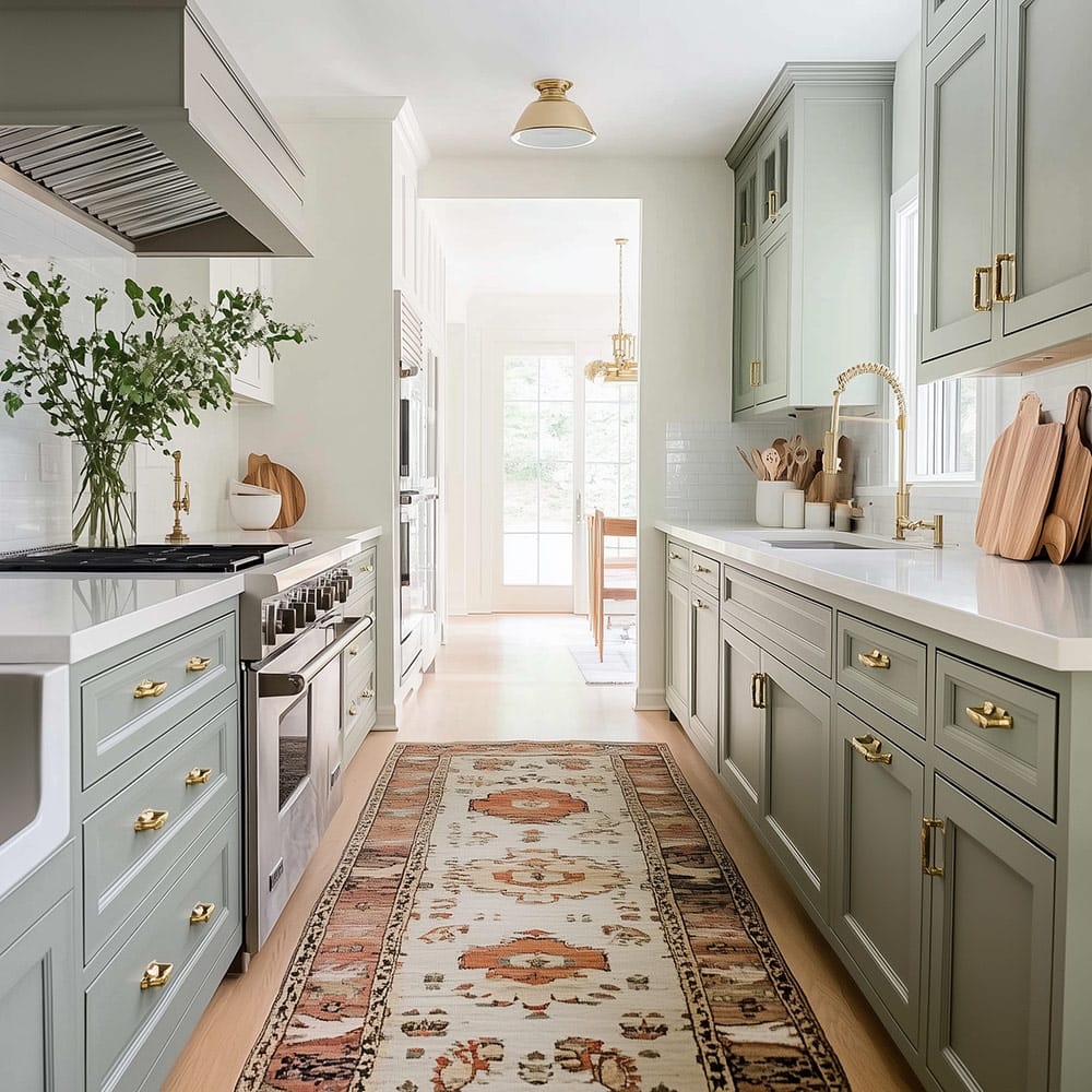
Sherwin Williams Sensible Hue
Sensible Hue is that shade that hums along quietly, giving just the right boost to a space. @modernprairiestudio’s kitchen is reflective of the rest of her home, a collection of carefully cultivated finds and cozy textures, soft neutrals and natural woods. Sensible Hue leans a bit green; a spark of vitality where other neutrals may fall flat.
Benjamin Moore Carolina Gull
Sometimes keeping it simple isn’t so simple. When Oak Story Design set out to design the kitchen of her dreams, the details were what mattered most. Taking risks with finishes such as cabinets painted in Benjamin Moore Carolina Gull. With rich notes of gray and warm green, it paid off in the end. The light-drenched space is soulful and serene.
Valspar Lush Sage

Never say never. When Cuckoo 4 Design redesigned her all white kitchen, she found herself drawn to the very shade of green that decked the halls of her childhood home. Once she conquered the flashbacks of wall-to-wall carpeting, selecting this tranquil, dark gray-green was a no-brainer. I love the crisp contrast between Lush Sage and the existing white cabinetry in this refresh.
Farrow and Ball Treron
Treron, a dark green color version of Farrow & Ball Pigeon, was applied to the bottom row of existing cabinets and the kitchen island peninsula while the white upper cabinets keep everything feeling light and airy. Although typically considered a traditional shade, Treron shines in this modern setting where natural materials and neutral colors are used as anchors.
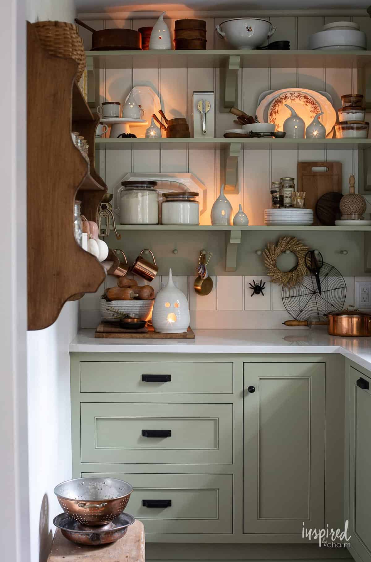
For more information, check out my post on how to add under cabinet lighting to maximize your workspace.
Farrow and Ball Lichen
My favorite aspect about this kitchen design by Elmor Avenue Kitchen Development is how the seamlessly the subtle details work to create a space that feels like a natural extension of the outdoors. Featuring Lichen by Farrow & Ball, the algae-like green compliments natural parquet flooring and oak dovetail drawers fit with bronze hardware. This kitchen sets the scene for 5-star cuisine.
More Designer Sage Green Colors We Adore
Unfortunately, I could not find an appropriate photo for every color that I wanted to (I even asked brands for examples). Alas, I know many of these would be beautiful, durable, and so soft and lush.
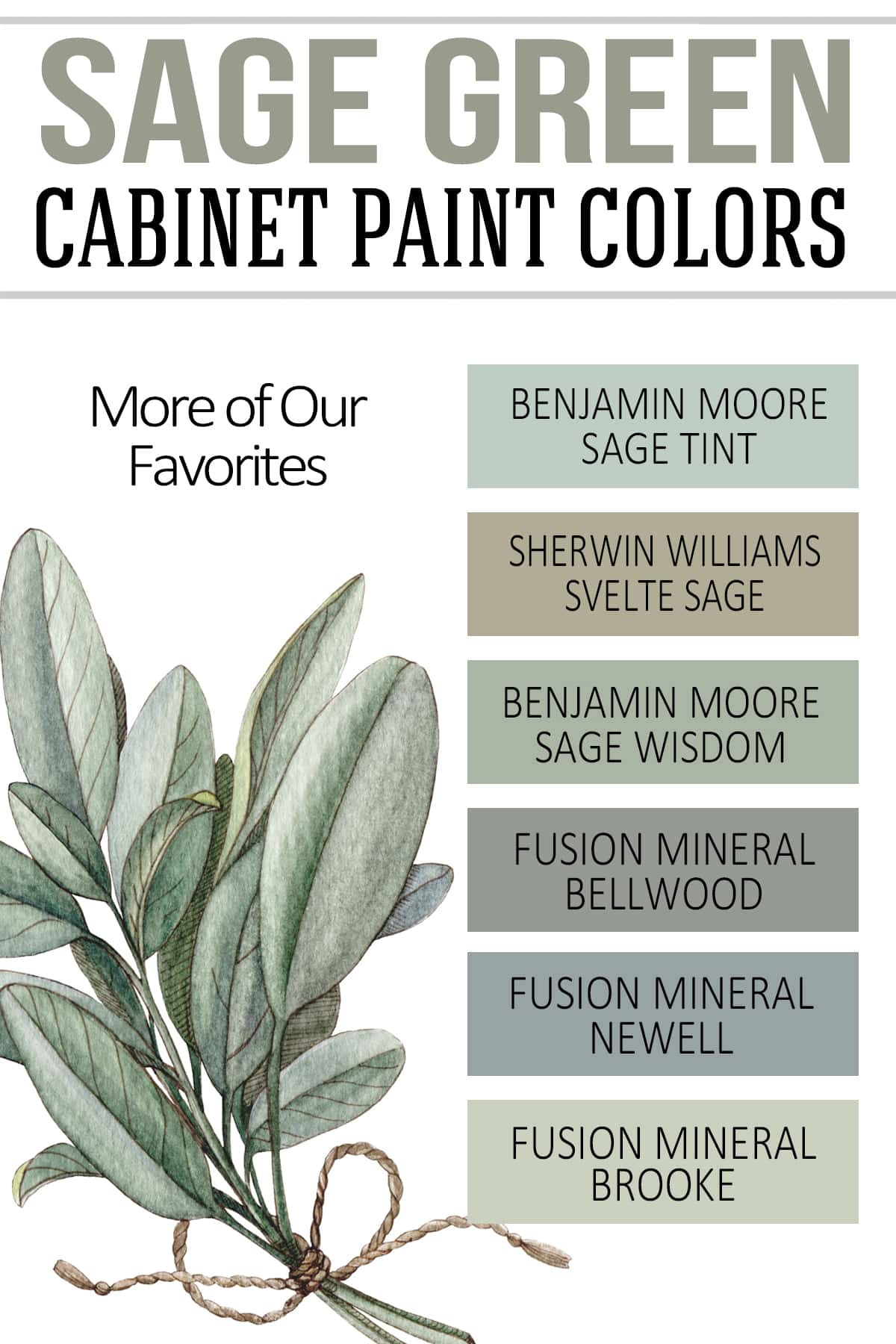
- Fusion Mineral Bellwood
- Fusion Mineral Brook
- Fusion Mineral Newell (Brand new for 2023!)
- Sherwin Williams Svelte Sage: This enchanting Earthy green has a khaki-like quality thanks to its brown and yellow undertones.
- Benjamin Moore Sage Wisdom: Add depth and make a subtle statement with this sophisticated green with cool gray undertones.
- Benjamin Moore Sage Tint. A beautiful mid-tone hue thats a chemeleon thanks to it’s undertones of green, blue, and gray.
Kitchen design is near and dear to my heart. And the satisfaction of a job well done is unlike any other room I hope you’ve gleaned some practical inspiration for your next endeavor!
Grab our free series "Weekend Home Projects that will Transform Your Life" Sign up below to receive updates including free printables, organization tips, home improvement projects, recipes and more! |
More Tutorials You Might Enjoy
PS I love seeing your creations! Be sure to take a photo and tag #cravingcreative on Instagram! You can also stay in touch with me through following me on Instagram, Pinterest, and subscribing to the newsletter!
mia says
thank you for posting non-AI kitchens, and for including all the paint colors! <3